
Metrics That Matter: Release Readiness, Business Value, and the End of Dashboard Theater
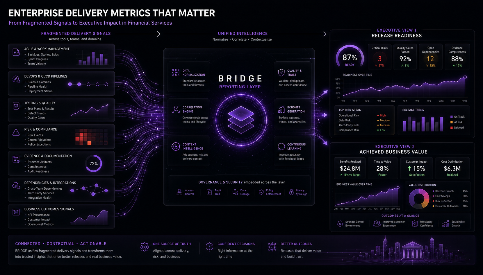
Published on Jul 14, 2026
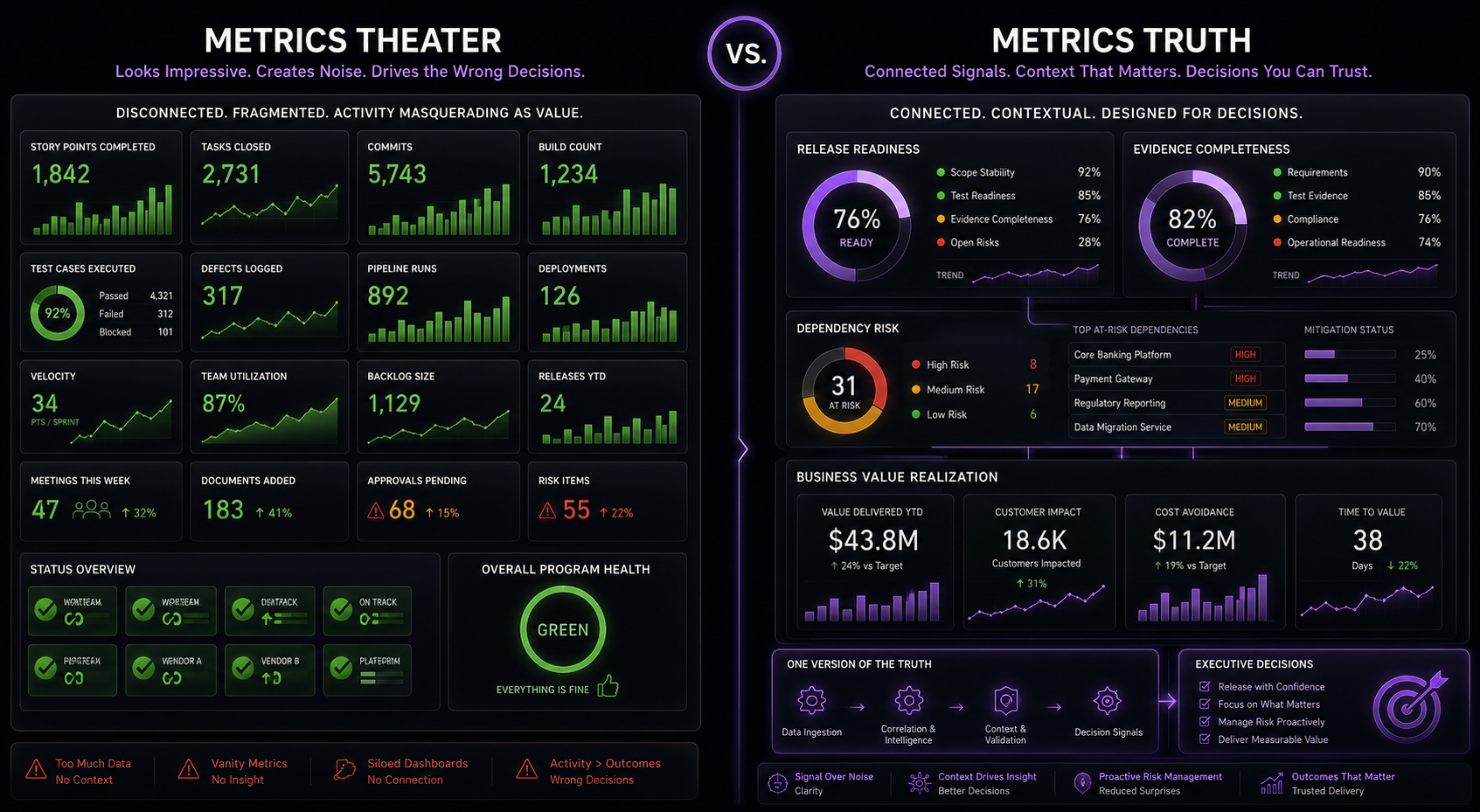
Metrics should help leaders make better decisions before release week starts screaming.
Metrics That Matter: Release Readiness, Business Value, and the End of Dashboard Theater
Everyone has metrics.
The average large Financial Services technology organization has more metrics than a casino has cameras. Agile metrics. DevOps metrics. QA metrics. Release metrics. Risk metrics. Audit metrics. Budget metrics. Operational metrics. Transformation metrics. Dashboard metrics. Dashboard metrics about dashboard metrics.
And still, somehow, the two questions that matter most often remain sitting in the corner like unpaid invoices:
- Are we actually ready to release?
- Did the thing we released actually deliver business value?
That is the metrics problem.
Most firms already measure plenty. The trouble starts when those measurements never assemble into something a leader can use when the release decision gets uncomfortable.
Financial Services firms are not short on dashboards. They are short on trusted connective tissue between the things teams do, the risks leaders own, the evidence auditors expect, the outcomes the business funded, and the actual state of the release.
Most enterprise metrics environments are optimized around local views of performance. Agile teams report sprint health. DevOps teams report pipeline health. QA reports test execution. Release teams report readiness checklists. Risk and control teams report exceptions. Product teams report benefits. Finance reports spend. Operations reports incidents.
Each view has a job. Each view can be useful. The trouble starts when leaders need an integrated release decision and everyone shows up with a different screenshot.
That is the Thursday afternoon ritual: a release lead trying to reconcile tool exports, dashboard snapshots, stale RAIDD logs, meeting notes, and somebody’s spreadsheet named weekly-status-consolidated-dashboard-final-final-v7.xlsx.
That is adversarial archaeology, where everyone shows up to a stressful, last-second meeting ready to defend their own turf, while trying to reconstruct the history and evidence into a coherent, defensible view of the current state.
And adversarial archaeology is a terrible operating model.
If you have been around enough release-readiness calls, you know the scene. Someone asks whether the customer-notification dependency is closed. The Jira epic says yes. The integrated test lead says no. The ServiceNow change record does not mention it. The person who actually knows the answer is on PTO, because of course they are. Fifteen minutes later, the room has learned nothing except that the dashboard was mostly decorative.
The Metrics Lie We Keep Telling Ourselves
Metrics theater is what happens when the dashboard proves work happened but cannot prove whether the release should proceed.
The lie is simple:
If we measure enough things, leaders will eventually understand what is happening.
Sure. Give that a shot and let me know how it works out for you.
Measurement without decision-led design usually creates more noise. A useful metric starts with a decision. If nobody can name the decision a metric supports, the metric is probably dashboard garnish.
A team velocity chart can help a team inspect its delivery pattern. A deployment frequency trend can help an engineering leader understand pipeline flow. A defect aging report can help QA. A dependency heatmap can help release management. A benefits realization view can help product leadership.
Those are all completely legitimate. They also do not, individually or all together, answer the question that real executives want to know:
Given the target release date, business intent, impacted systems, test evidence, operational readiness, open risks, unresolved dependencies, control obligations, and value expectations — are we confident enough to release?
Most dashboards were built to show activity. Activity proves motion. Readiness requires hard evidence. Value requires an outcome. Confidence requires enough connected truth to make a decision without everyone squinting at three dashboards and a spreadsheet.
Activity-based reports are just noise wearing a fancy shirt.
The dangerous dashboard is not the obviously bad one. The dangerous dashboard is the one that looks polished enough to create confidence while still failing to answer the question in front of the room. That is how leaders get lulled into a green status while the release is quietly chewing through its own wiring.
Good Metrics, Wrong Job
This article is not here to dunk on every existing metrics framework. DORA metrics are useful. Flow metrics are useful. SPACE is useful. Agile metrics are useful. Operational resilience metrics are useful. Risk data aggregation principles are useful. Secure SDLC measures are useful.
The problem usually appears when leaders expect one metrics framework to answer a question it was never designed to answer.
DORA is excellent at delivery performance
DORA’s software delivery metrics focus on throughput and instability: change lead time, deployment frequency, failed deployment recovery time, change failure rate, and related stability measures. DORA frames these measures as a way to understand software delivery performance and continuous improvement, rather than as a complete business-value or release-governance model. source
DORA matters because speed and stability belong in the same conversation. DORA’s research notes that speed and stability are not long-term tradeoffs and that the metrics can help teams understand delivery performance across throughput and instability. source
A steering committee still needs something more when an integrated release has regulatory exposure, shared test environments, unresolved dependencies, and conditional risk acceptance. DORA can inform that decision. DORA does not replace the decision model.
For example, a platform team might show excellent deployment frequency and fast recovery across its own services while the integrated release still depends on a downstream batch process, a shared certification environment, and an approval exception sitting in someone else’s queue. The engineering metrics are useful. They just are not the whole release story.
Flow metrics are excellent at value stream visibility
The Flow Framework and value stream management movement pushed an important idea into enterprise technology leadership: delivery should be viewed through the flow of value from idea to outcome, not just disconnected team activity. The Flow Framework positions itself around end-to-end product value streams, bottlenecks, dependencies, flow, and business outcomes. source
That shift matters.
Flow metrics can expose bottlenecks, wait states, rework, aging work, load, distribution, and value stream friction. They are especially powerful when the organization is trying to understand why software delivery feels slow even while teams appear busy. source
Flow still needs help when leaders ask whether evidence is sufficient, whether the right person accepted the risk, whether operations is ready, or whether the customer outcome materialized. Flow tells leaders where work moves and where work slows. Release confidence needs additional signals.
A value stream can look healthy while the release train is carrying a bad payload. Work may be moving. That does not mean the controls are satisfied, the evidence is current, or the business value survived the trip.
SPACE is a reminder that people are not factories
The SPACE framework is a useful antidote to lazy productivity reporting. It argues that developer productivity cannot be reduced to a single metric and should be considered across satisfaction and well-being, performance, activity, communication and collaboration, and efficiency and flow. source
That matters even more now that AI-assisted development can make activity metrics look heroic while quality, learning, or stability quietly go sideways.
SPACE gives leaders a better way to think about developer productivity. It does not determine whether a specific regulated release should proceed next Friday.
Risk, resilience, and control frameworks force seriousness
Financial Services is not a playground for “move fast and YOLO the core banking platform.” Operational resilience, secure software development, technology governance, risk data aggregation, incident management, and change control all matter.
The Digital Operational Resilience Act establishes a comprehensive framework for digital operational resilience across EU financial entities. source FFIEC guidance emphasizes governance, development, acquisition, maintenance, and change-control practices. source NIST SSDF emphasizes integrating secure software development practices into SDLC implementations. source BCBS 239 emphasizes accurate, comprehensive, and timely risk data aggregation and reporting. source
Expectations vary by jurisdiction and institution, but the spirit is hard to ignore: critical technology delivery needs control, evidence, and accountability.
The control world still struggles when framework expectations show up as late evidence requests instead of early delivery telemetry. Late evidence requests turn governance into reverse-engineering with a badge.
Where Financial Services Companies Struggle Most
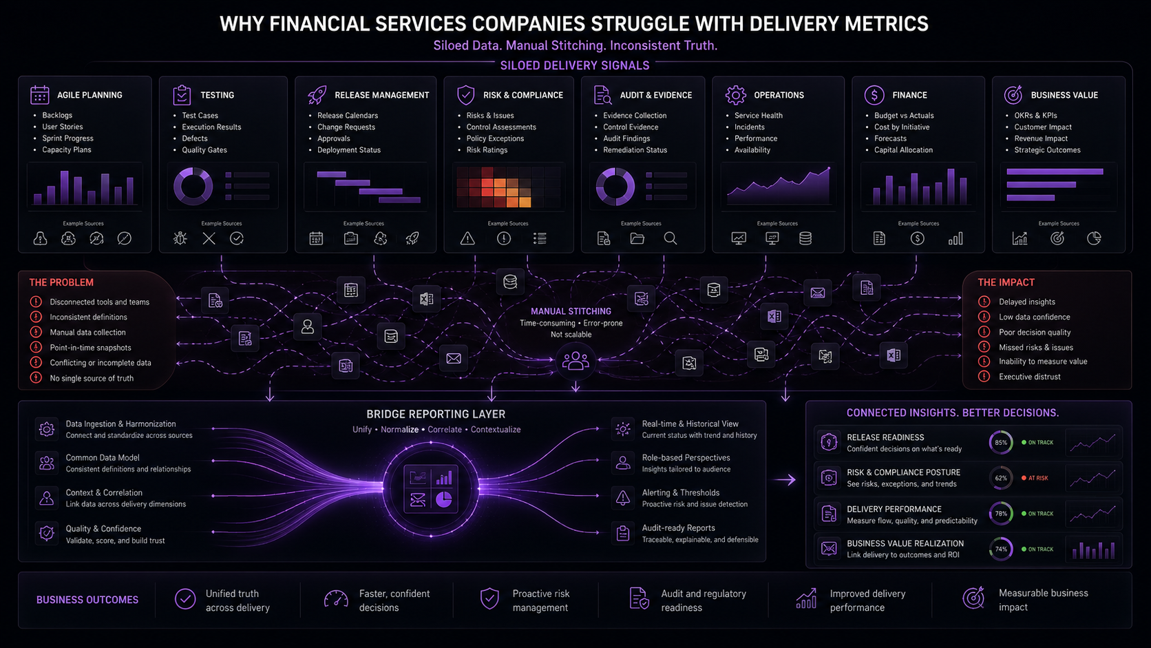
The hard part is connecting metrics across delivery, risk, evidence, operations, and value.
Financial Services organizations struggle with metrics because the operating environment is brutally complex. That is reality.
Large banks, insurers, payments companies, asset managers, and financial market infrastructure providers rarely ship one clean product through one clean pipeline into one clean production environment with one clean team and one clean owner.
They ship through legacy platforms, shared services, regulatory obligations, test environment constraints, vendor dependencies, integration layers, release trains, security reviews, data controls, operational readiness checks, and funding models that were often designed by people who thought “product operating model” was something sold at an airport bookstore.
The same failure patterns appear over and over.
1. Team metrics do not roll up into release truth
An agile team can be green while the release is red. A release can be green while a control exception is unresolved. A test execution dashboard can be green while the most important evidence is missing. A dependency can be known by five people and visible in zero dashboards.
Local metrics regularly fail at integrated release governance because the release is a system-level event, not a team-level status update.
2. Readiness is treated as a meeting, not a data product
Release readiness is often reviewed in recurring ceremonies where humans verbally reconcile tool data.
That can work at small scale. At enterprise scale, it becomes a fragile social process pretending to be a control system.
The meeting becomes the integration layer. That smell is not maturity.
A meeting has no schema, no lineage, no automated validation, and no reliable memory beyond minutes, notes, and the heroic recall of whoever has been carrying the release since February. Eventually someone says, “I think we’re good,” while everyone else quietly ages.
3. Business value is declared too early
Many organizations are decent at tracking whether work shipped. Fewer are good at tracking whether the shipped work produced the expected business outcome.
Business cases are approved before work starts. Benefits are described in strategy decks. Product funding is justified with value language. Then delivery begins, metrics shift to execution, and the value thread weakens with every handoff.
By the time the release lands, the organization can often explain what was delivered better than it can explain what changed for the business.
That gets expensive fast.
4. Metrics are trapped in tool silos
Jira knows part of the work. GitHub knows part of the engineering activity. CI/CD tools know part of the deployment path. Test tools know part of the quality picture. ServiceNow knows part of the operational and change record.
Confluence, Teams, SharePoint, and meeting notes know plenty of important things, mostly in prose. Finance knows spend. Product knows expected value. Operations knows pain.
The executive dashboard usually knows whatever someone manually stitched together by Thursday afternoon.
That person becomes the unofficial integration layer. They know which spreadsheet is more current than the dashboard, which dashboard ignores the vendor dependency, which Jira filter is lying because the workflow status is stale, and which risk was softened from red to amber because the meeting was running out of time. Very mature. Very enterprise. Very avoidable.
5. The metrics model is designed after the process
Reporting is often an afterthought.
The process gets designed. The tools get configured. The operating model launches. Then someone asks, “What should we report?”
That sequence is backwards.
If release readiness matters, readiness needs a data structure. If achieved business value matters, value needs a data structure. If governance evidence matters, evidence needs a data structure.
Otherwise, the organization tries to build executive visibility from artifacts designed for local team execution.
That is how dashboards become expensive mirrors.
They reflect effort. They do not explain truth.
The Two Metrics Questions That Matter Most
For large custom product programs in Financial Services, two questions sit above the rest.
They are simple questions. Which is why it is impressive how many dashboard ecosystems manage to dodge them.
1. Are we ready to release?
Release readiness is a structured conclusion based on evidence.
A real release-readiness model should summarize:
- scope stability
- open defects
- test coverage
- test execution status
- unresolved dependencies
- operational readiness
- security and control evidence
- environment readiness
- data readiness
- approval status
- risk acceptance
- rollback readiness
- customer or colleague impact
- regulatory or audit exposure
- residual risk
The model should explain why the release posture is what it is. It should show what changed, what is missing, who owns the open decisions, and whether the release is safe, conditionally safe, or clearly not ready.
If a dashboard cannot answer those questions, calling it a release-readiness dashboard is generous.
Mood board is closer.
Pretty colors. Thin evidence. High confidence theater.
A useful readiness view should survive the first follow-up question. If the answer to every executive question is, “Let me check with the team and get back to you,” then the dashboard is not a cockpit. It is wallpaper with ambition.
2. Did we achieve business value?
Achieved business value deserves the same discipline. McKinsey’s Developer Velocity research connects software excellence with stronger business performance, including revenue growth, shareholder returns, operating margin, innovation, customer satisfaction, brand perception, and talent management. source
A real value model should connect:
- original business intent
- expected value hypothesis
- value owner
- measurable outcome
- target population
- release scope
- adoption or usage signal
- customer / colleague experience signal
- operational efficiency signal
- risk reduction signal
- revenue, cost, loss, compliance, or resilience impact
- actual observed result
- time horizon
- confidence level
The hard part is keeping the value thread connected from intake through delivery, release, adoption, and post-release measurement.
That is where many organizations lose the plot.
The release lands. The value wanders off. Nobody files a missing-person report.
A fraud-reduction enhancement ships. A claims workflow automation goes live. A customer-authentication change reaches production. Everyone celebrates delivery. Three months later, nobody can cleanly say whether fraud losses moved, cycle time improved, customer drop-off changed, or operational exceptions decreased. The work shipped. The value escaped custody.
What a Better Reporting Layer Needs To Do
This is where we stop complaining and start building.
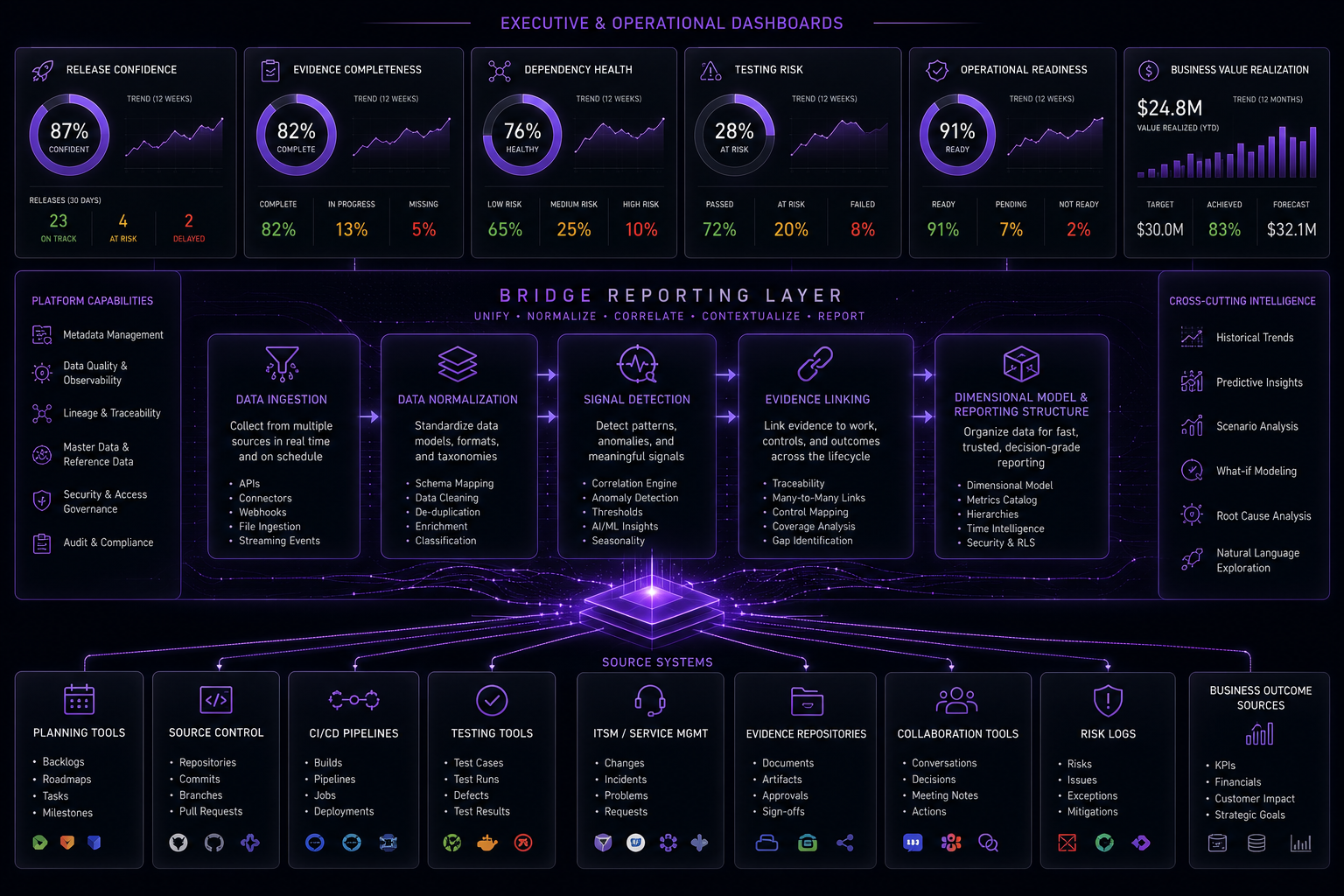
Better reporting starts with the assumption that useful data already exists. The job is to aggregate, normalize, connect, and explain it.
Let’s take a practical position: delivery teams should not become part-time data-entry clerks for another governance dashboard.
That would be cruel. It would also fail.
A better reporting layer starts with a simple premise:
The delivery system already produces signals. The reporting layer should capture and connect those signals without adding unnecessary overhead to teams.
Better reporting should aggregate existing performance data from wherever the work already happens:
- Jira
- Azure DevOps
- GitHub
- GitLab
- CI/CD pipelines
- test management tools
- deployment tools
- release orchestration tools
- ITSM platforms
- risk and issue logs
- evidence repositories
- Teams / SharePoint / Confluence
- operational monitoring tools
- business outcome sources
The delivery toolchain remains the toolchain, but with a reporting-optimized structure over it, shaped around the decisions that matter.
Reporting-Focused Data Structures From the Start
Most enterprise data models are optimized for transactions. Systems of record need that.
Reporting needs a different shape.
How about a reporting-focused data structure from the start, optimized for query performance, dimensional analysis, release snapshots, and executive decision views?
At the conceptual level, the reporting layer needs several core structures.
Core dimensions
- program
- product
- value stream
- release
- application / component
- team
- work item
- capability
- business outcome
- risk category
- evidence type
- environment
- control / compliance obligation
- time
Core facts
- delivery event
- work item flow
- release readiness snapshot
- dependency state
- risk signal
- evidence state
- defect state
- test execution state
- approval state
- deployment event
- incident / operational impact
- business value realization
Core summary tables
- release confidence summary
- value realization summary
- dependency health summary
- evidence completeness summary
- delivery flow summary
- risk exposure summary
- operational readiness summary
This is the boring part, which means it matters.
Nobody gets executive applause for a well-designed fact table. Fair. But the most impressive AI-generated summary in the world will not save a reporting layer built on mush.
Good reporting requires boring discipline. Once the structure exists, it can be filled with synthetic data for demos, then real client data through adapters, without asking every agile team to manually feed the beast.
The feed-the-beast model is how reporting programs become enemies of the people they claim to help.
What Decision-Grade Reports Should Show
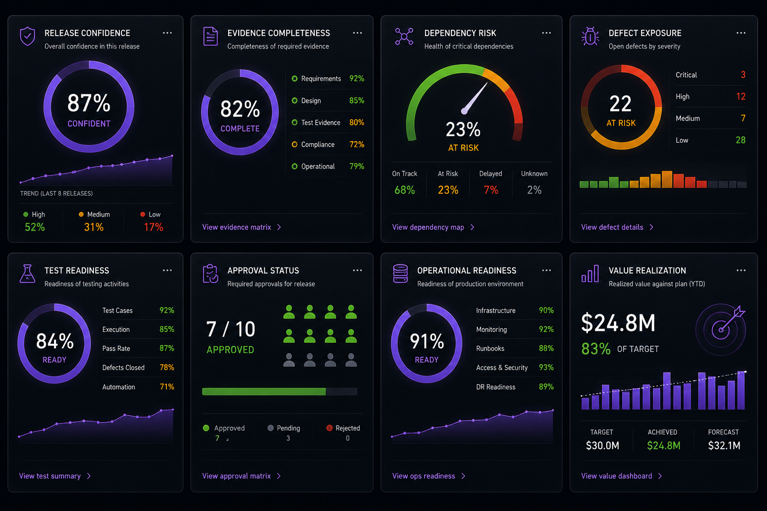
Reporting should feel modular: focused widgets that answer specific readiness, evidence, risk, and value questions — not one giant dashboard trying to swallow the room.
Reporting should work like a decision enablement system with focused views, not a wall of charts.
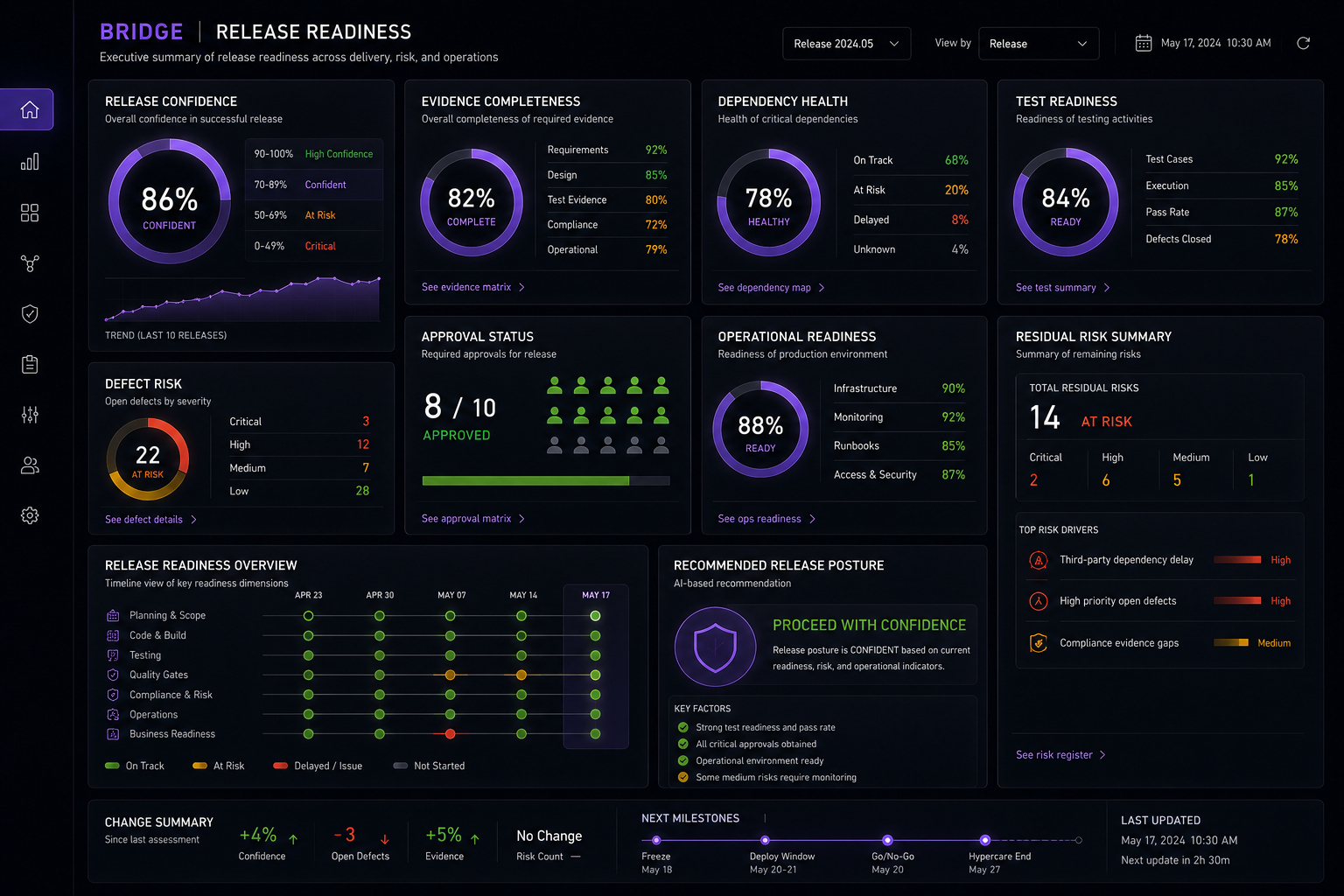
A release readiness dashboard should explain the decision, not just decorate the meeting.
1. Release Confidence Dashboard
This is the executive cockpit. It should answer:
- What is the release confidence score?
- What changed since the last checkpoint?
- What evidence is complete?
- What evidence is missing?
- What dependencies are unresolved?
- What tests are incomplete or failing?
- What approvals remain open?
- What operational readiness gaps exist?
- What risk has been accepted, and by whom?
- What is the recommended release posture?
A structured release-confidence position beats another green square with a nervous owner.
Green without evidence is just optimism with a color code.
The difference is simple: a green square asks leaders to trust the color. A release-confidence position shows the evidence trail, the open decisions, the owners, and the residual risk. One is a status symbol. The other is a decision product.
2. Evidence Completeness View
This view should separate evidence existence from evidence quality.
A document attached to a ticket is not always evidence. Sometimes it is just a file with confidence issues.
The view should show:
- required evidence by release scope
- evidence provided
- evidence missing
- evidence stale
- evidence rejected
- evidence owner
- linked controls
- linked test cases
- linked approvals
3. Dependency Health View
This view should make hidden coupling visible.
It should show:
- open dependencies
- dependency aging
- upstream / downstream owner
- release impact
- confidence impact
- blocked work items
- escalation path
- dependency trend
4. Testing and Defect Risk View
This view should connect testing to release confidence, instead of stopping at execution percentage.
It should show:
- coverage by impacted capability
- pass / fail / blocked test status
- severity-weighted defect exposure
- defect escape risk
- unresolved test evidence gaps
- critical path test readiness
5. Business Value Realization View
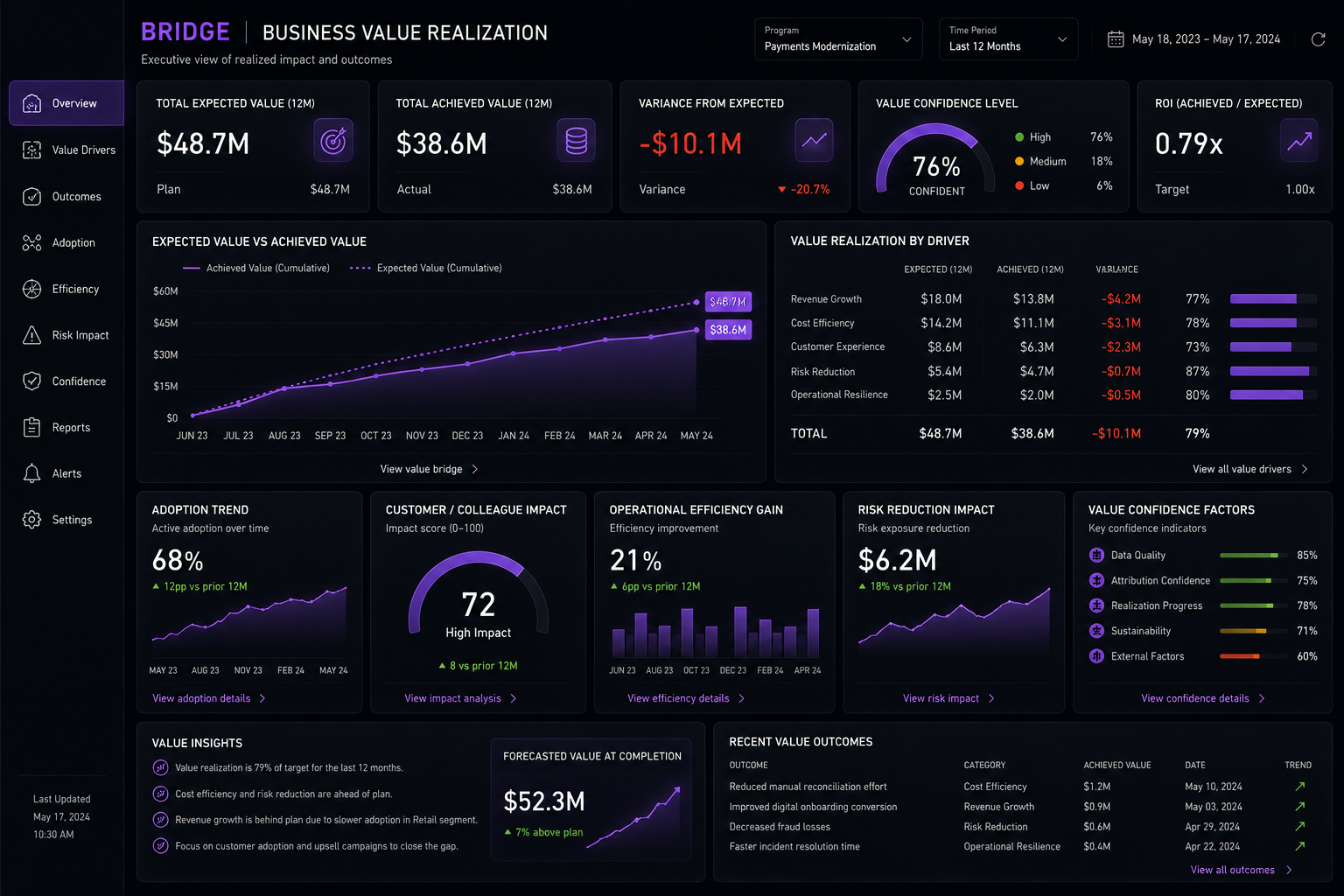
Value realization should remain connected to the release after funding approval, delivery execution, and post-release measurement.
This is where many dashboards fail.
The value dashboard should show:
- expected value hypothesis
- realized value signal
- adoption or usage
- operational efficiency impact
- risk reduction impact
- customer / colleague outcome
- confidence level
- measurement window
- value owner
- variance from expected value
This reporting view should make one thing brutally obvious:
Shipping is not the same thing as succeeding.
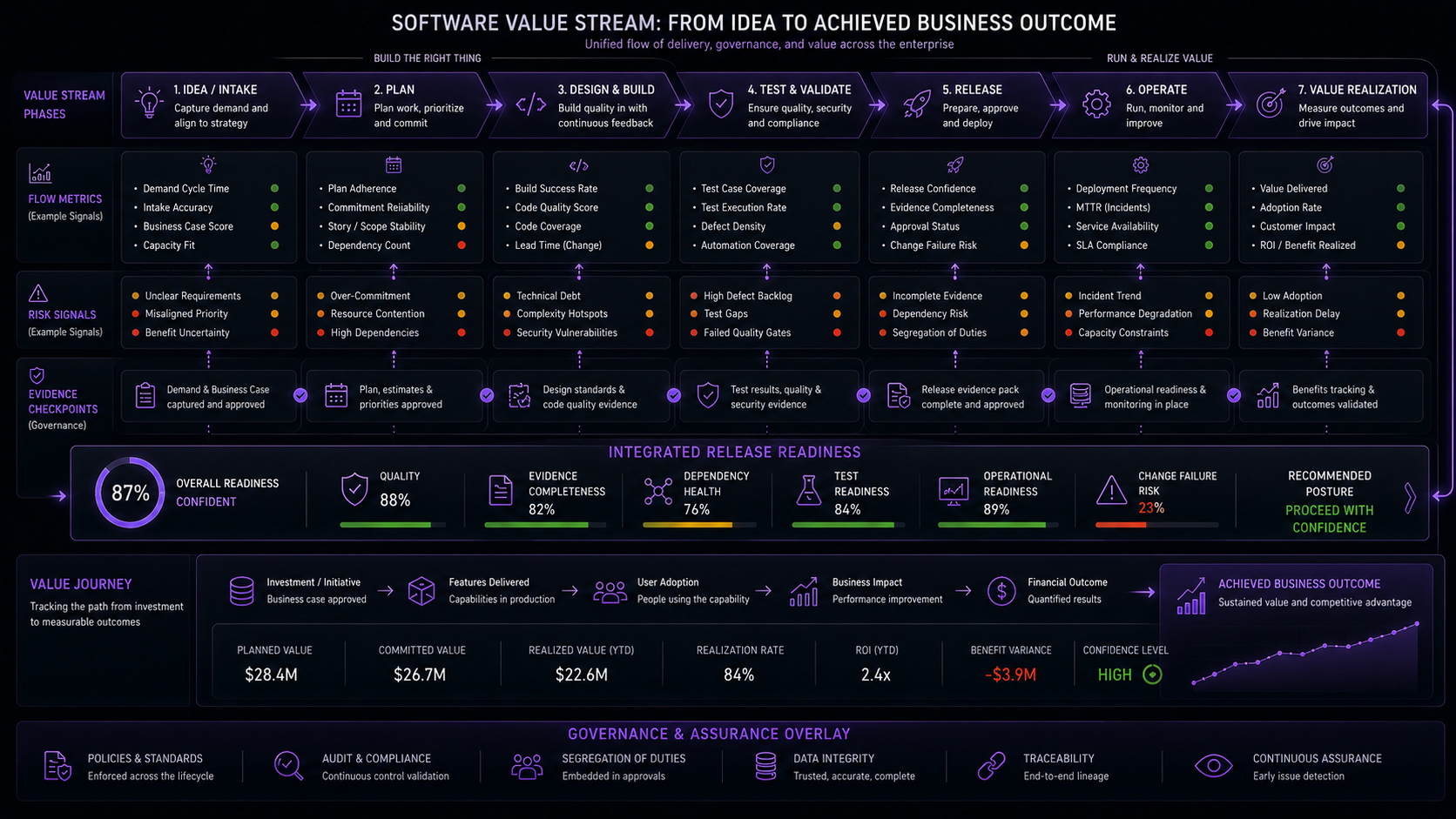
A better metrics model connects governance, evidence, readiness, and business outcome signals across the value stream from idea to production to realized value.
Metrics by SDLC Phase
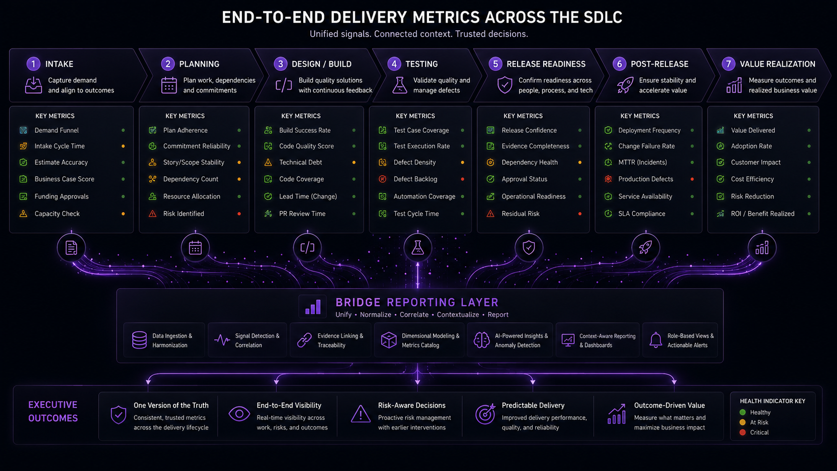
Different phases need different signals. The trick is connecting those signals into one decision model.
The reporting layer should support metrics across the full delivery lifecycle.
Intake and shaping
- intent clarity score
- business outcome link completeness
- funding-to-capability traceability
- risk classification completeness
- impacted system identification completeness
- dependency hypothesis count
Planning
- scope volatility
- commitment confidence
- capacity / demand mismatch
- release train alignment
- critical dependency exposure
- evidence expectation completeness
Design and build
- architecture decision readiness
- security / control design completeness
- cycle time by work type
- work item aging
- pull request / review latency
- build health
- code quality signal trends
Testing
- test coverage by impacted capability
- automation coverage
- blocking defect exposure
- environment availability
- test evidence completeness
- defect reopen rate
- escaped defect history
Release readiness
- release confidence score
- unresolved dependency count
- control evidence completeness
- approval completeness
- operational readiness status
- rollback readiness status
- residual risk position
Post-release
- incident rate
- failed deployment recovery time
- adoption / usage signal
- customer / colleague experience signal
- expected-vs-actual value variance
- operational efficiency impact
- risk reduction realized
Please do not put all of this on one dashboard.
Nobody needs a Financial Services mission-control wall that looks like it was designed by someone trapped in a procurement portal.
The point is to maintain a connected reporting model so the right view can be generated for the right decision at the right time.
The Operating Principle: No Extra Team Overhead
The most important reporting principle is this:
Do not ask teams to maintain a second shadow-process just to satisfy reporting.
The data should come from the work.
That means:
- work item events come from planning tools
- code and deployment events come from engineering tools
- test signals come from test tools
- change and incident signals come from ITSM
- evidence comes from repositories and linked artifacts
- risk signals come from structured logs, dependency data, and meeting notes
- business outcome signals come from adoption, operations, finance, product, or risk sources
When teams must manually retype the same information into a reporting layer, the reporting layer has already lost.
In a better future, normal data flow operations should extract, normalize, summarize, and explain. Humans should validate, decide, and improve the system.
That division of labor feels sane. Rare, I know. But sane nonetheless.
The work should create the signal. The team should not become the signal.
Nobody joined a delivery team because they dreamed of becoming a nightly ETL process with a badge. If the reporting model depends on humans retyping tool data into another tool, the model is already negotiating its own failure.
AI-Forward, Not AI-Decorated
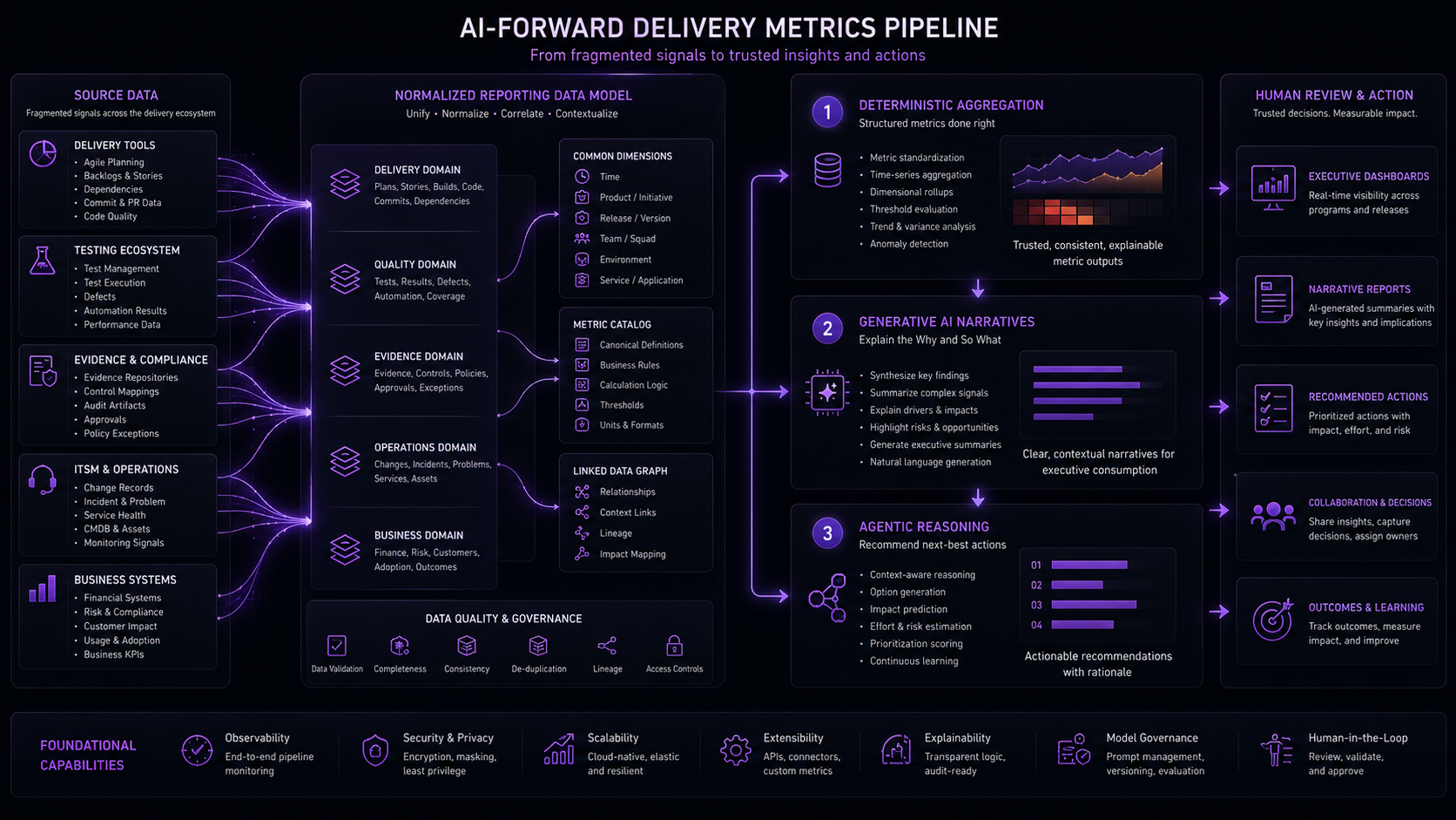
AI should help convert fragmented delivery signals into decision-grade summaries. It should not become another decorative dashboard feature.
AI has a role here. A useful one.
That role is not “chat with your dashboard,” as if the dashboard is lonely.
The better role is signal interpretation and decision support.
In a better reporting model, AI can help with:
- extracting risk signals from meeting notes
- summarizing release confidence changes since last checkpoint
- identifying evidence gaps from artifact metadata
- explaining dependency risk in business language
- generating executive release briefs
- summarizing business value realization gaps
- recommending next-best actions for human review
The foundation still has to be a disciplined data structure.
AI on top of bad data creates confident nonsense at scale.
Financial Services already has enough expensive nonsense with confident formatting.
Confidence without lineage is just a well-dressed guess.
A model that summarizes bad lineage, stale evidence, and disconnected risk signals can sound very impressive while being profoundly useless. That is worse than a bad dashboard because it talks back.
What Everyone Gets Wrong
Most enterprise metrics programs fail for five familiar reasons.
None of them are mysterious. That does not seem to stop anyone.
They optimize for reporting before decisions
A useful metric starts with a decision.
If nobody knows what decision a metric supports, the metric is probably dashboard garnish.
They confuse team performance with system performance
A team can be performing well inside a system that is failing.
The bottleneck may be dependency management, environment access, test data, release governance, approval latency, or production change policy.
Punishing the team metric does not fix the system constraint.
They use activity as a proxy for value
Story points, closed tickets, and completed deployments can be useful signals. They are not the outcome.
Value shows up when a customer behavior changes, an operational burden drops, a risk exposure declines, a revenue path opens, a loss event is avoided, or a colleague can stop doing some horrible manual workaround that should have died years ago.
They measure too late
A readiness dashboard that becomes meaningful only two days before release is a weather report after the roof is gone.
At that point, the dashboard is not warning you. It is narrating the damage.
By that point, the organization is not managing readiness. It is negotiating damage.
They do not design for traceability
If a dashboard cannot link from executive summary to source signal, confidence collapses.
Traceability is how trust survives executive pressure.
When the room gets hot, lineage matters.
A Better Future
The next useful leap in Financial Services delivery metrics will probably not come from another dashboard suite. It will come from connecting the signals teams already create into a decision layer leaders can trust.
That layer should:
- aggregate existing toolchain data
- preserve change intent
- detect delivery and risk signals
- maintain evidence traceability
- connect release readiness to source artifacts
- connect delivered scope to value realization
- support executive, delivery, risk, and audit views
- reduce manual status theater
- improve release confidence
Pretty reporting is nice. Better decisions pay the bills.
A dashboard that cannot change a decision is a screensaver with ambition.
A beautiful dashboard that cannot change a decision is office decor. A plain dashboard that surfaces the right risk three weeks earlier is worth its weight in avoided war rooms.
Where This Starts to Point
The better future is not mysterious.
It needs a delivery operating model where reporting is designed around decisions, not dashboards.
It needs intent that survives the trip from intake to production.
It needs release readiness that can be explained with evidence.
It needs business value that stays connected after funding approval.
It needs risk and dependency signals to surface before release week turns into an archaeological dig with snacks.
That is the direction this series is heading.
BRIDGE is the operating model I am developing to bring those pieces together.
CLEAR is intended to preserve intent and evidence continuity.
RADAR is intended to detect signals and weak indicators.
The reporting layer is intended to aggregate and normalize performance data from existing systems.
Release Confidence translates connected signals into decision-grade readiness.
Business Value Realization keeps the value thread alive after release.
That is the point of the whole thing: not better charts, but better decisions.
Can you answer the questions from leaders that actually matter:
- What changed?
- Why did it change?
- Is it tested?
- Is the evidence complete?
- What risk remains?
- Who accepted that risk?
- Are we ready to release?
- What value was expected?
- What value was achieved?
- What should we improve next?
Everything else is dashboard theater.
Dashboard theater is expensive because it feels like progress right up until the moment someone asks for proof.
Closing Thought
The most dangerous metric in enterprise technology is the one that makes people feel informed while leaving them unable to decide.
Financial Services does not need more dashboards that glow green until the release starts making banshee noises. It needs connected visibility, explainable release readiness, traceable business value, and metrics that help leaders make real decisions about real work using real delivery signals.
That is where BRIDGE is headed.
If we get it right, the next generation of delivery reporting asks better questions than, “How busy were we?”
It asks:
Are we ready?
Did it matter?
Those are the real questions.
Join the Conversation
Where do metrics break down most in your delivery environment?
Is it release readiness?
Business value realization?
Dependency visibility?
Evidence completeness?
Executive reporting?
Or the classic favorite: everything is green until someone asks one specific question and the room suddenly discovers gravity?
I would love to hear the real-world version.
Not the dashboard-demo version.
Not the steering committee version.
The actual version.
The place where the numbers stop helping and people start reconstructing reality by hand.
A few questions I’m especially interested in:
- Which metrics create the most confidence in your organization?
- Which metrics create the most noise?
- Where does release readiness become subjective?
- Where does business value disappear after funding approval?
- Which dashboard looks useful until someone asks a serious follow-up question?
- What signal do you wish your delivery model surfaced three weeks earlier?
Because that is where this conversation gets interesting.
Not when metrics prove people were busy.
When metrics help leaders make better decisions before the release starts making expensive noises.
If you’ve lived through that version, I want to hear about it.
About the Author
Joe Mack is a Technology Consulting Senior Principal specializing in technology leadership, enterprise SDLC transformation, release management, deployment governance, and delivery optimization for household name Financial Services companies. Joe is also a lifelong self-learner and builder of systems, and Free Tier Life is one of the ways he is trying to turn those experiences and instincts into something other people can actually use.
Bibliography
- DORA. “DORA’s Software Delivery Performance Metrics.”
- DORA. “2024 DORA Report.”
- Google Cloud. “Announcing the 2024 DORA Report.”
- Planview. “The Flow Framework: A Prescriptive Approach for Transitioning from Project to Product.”
- Flow Framework. “Discover the Flow Framework.”
- DORA. “Value Stream Management.”
- Forsgren, Nicole; Storey, Margaret-Anne; Maddila, Chandra; Zimmermann, Thomas; Houck, Brian; Butler, Jenna. “The SPACE of Developer Productivity.” ACM Queue, March 6, 2021.
- SPACE Framework. “The SPACE Framework.”
- European Banking Authority. “Digital Operational Resilience Act.”
- Basel Committee on Banking Supervision. “Principles for Operational Resilience.”
- Basel Committee on Banking Supervision. “Principles for Effective Risk Data Aggregation and Risk Reporting.” January 2013.
- FDIC / FFIEC. “Updated FFIEC IT Examination Handbook – Development, Acquisition, and Maintenance Booklet.” August 29, 2024.
- NIST. “Secure Software Development Framework.”
- McKinsey & Company. “Developer Velocity: How Software Excellence Fuels Business Performance.” April 20, 2020.
- Microsoft Azure Blog. “Developer Velocity: Empowering Developers to Fuel Business Performance.”